Could I make Scrabble accessible to someone – specifically my father – whose eyesight has deteriorated badly?
Initial Strawman
Starting out with a basic user interface to see if he could see the tiles in his hand and those already on the board well enough to play the game. Initial thoughts were to maximize the size of the tiles in his hand, provide a zoomable view onto the board and absolute minimum of other controls/clutter around it. Dragging tiles from the rack to the board felt like the obvious way to place them.
Here’s roughly what the first prototype looked like:

Zoom as Far as you Like
The blue zoom buttons let you blow up the board as large as you want – though you then have to scroll up/down and sideways to see different areas. With a touch-screen that’s a breeze!
The centre-right blue button zooms out to the full board – which works well when connecting the laptop to a large screen TV. That lets you see more of the board at a time but when you’re ready to place tiles, zooming in so that the squares are clearly visible on the latop lets you drag and drop accurately.

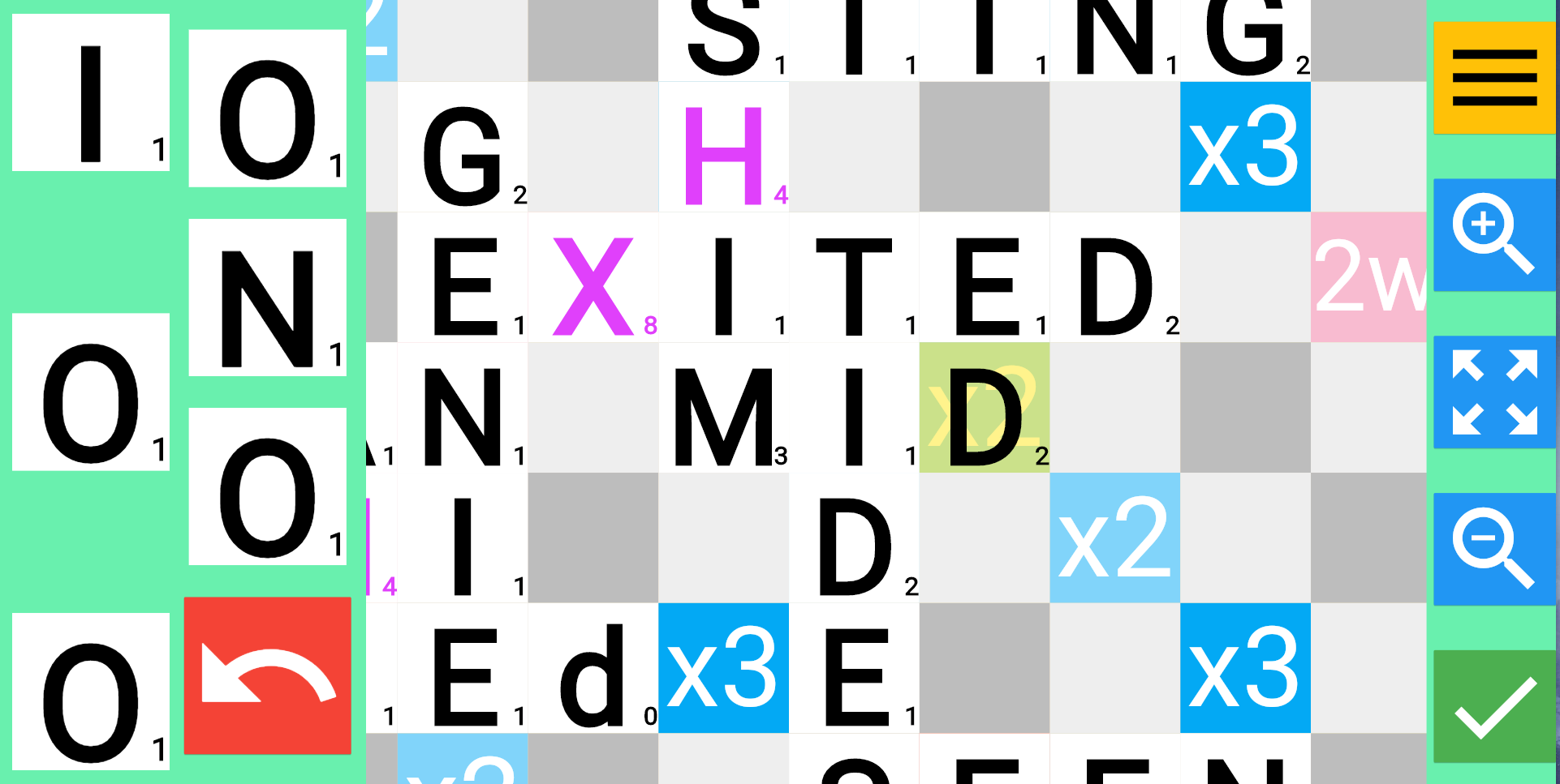
Bigger Letters Please
The size of the letters in the rack (left hand column) was insufficient though – so we moved to the two column approach below. The undo arrow (put all tiles back in rack) and check-mark (submit) buttons go red and green respectively when they can be used. When placed together, as above, it’s too easy to hit the wrong one – so we moved the take-back button to the ‘rack’ side – filling the gap conveniently left by there being an odd number of tiles in the rack.

Placing Tiles
Dragging and dropping took a little bit of practice to get the hang of – but by refining it so that the squares lit up red or green to confirm where a drop would occur, this soon became perfectly doable.
Final Tweaks
It was difficult to distinguish some letters – specifically O and Q. Colouring the higher value letters (4 points and above) in purple rather than black helps here.
Although the plan was for me to do the scoring and checking of moves, Dad still wanted to understand the values of tiles – and the traditional small characters in the corners of the tiles are too small for him to see. A pop-up tooltip with the letter and score both in massive font helped – but a 3 second delay was needed to stop it appearing during a slightly hesitant drag operation. Every button also has its function shown in a HUGE pop-up – e.g. the ‘Zoom to show whole board’ button (centre right):
Conclusion
We had a workable user interface! Now it just needed to actually let you play scrabble.